One of the things that’s important to me in the work I do is accessibility. I keep a toolbox of things to do to help me design and develop more inclusively.
Note: this is an update of my previous Accessibility Toolbox article.
Which tools I use depends on the project, the team, where we are in the process, and how much time we have. The majority of the work I do is front-end development. I tend to think about accessibility as happening before, during, and after development. Another way of putting it is during design, development, and testing. There’s some cross-over between the phases, but these are handy buckets to use for sorting what to do when.
My goal is WCAG 2.1 compliance, at AA level for everything and at AAA for some things. The spec is long and little tricky, though. I don’t find it particularly easy or practical to use it as a checklist for day to day work. So, I try and find ways of working that’ll get me passing WCAG Success Criteria as automagically as possible. I want these to be a part of my process, not something that I have to remember to do.
Quick check
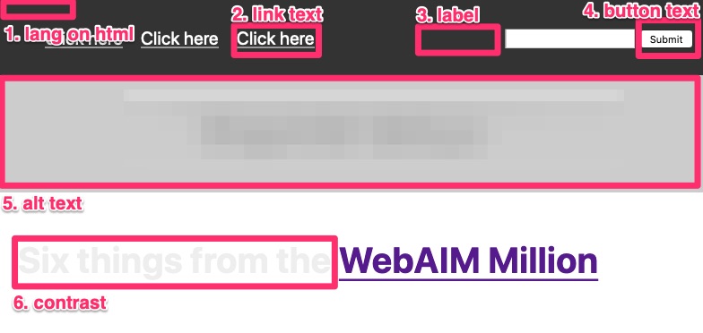
If I’m really pressed for time, I check a handful of things (If I have more time, I check these things first). They’re little extensions on the six most common problems from the WebAIM Million.
- A
langattribute on thehtmlelement. - Link text describes the destination of the link (no “click here” or “more”).
- Every
formcontrol has an associatedlabel. buttontext describes the action that will happen.alttext for images conveys the content and function of each image.- Colour contrast is at least 4.5:1 for text (including text over images) and 3:1 for graphics and UI components. (at least 7:1 for AAA)
I use a picture as a memory aid to remember these six things together.
 .
.
Design
This is the best time to consider accessibility. It’s more expensive to make changes later on: it might be mean rework in the code or redesign of the UI or the whole flow. (The very excellent Deque call this Shift Left Accessibility Testing.)
High level checks
Review the WCAG POUR Guidelines: Perceivable, Operable, Understandable, Robust. Some key things to check:
- Perceivable
- all non-text information has a text equivalent. Images have alt text that convey the content and function of the image (including any information conveying by colour change). Audio and video have transcripts and captions.
- colour contrast is at least 4.5:1 for text and 3:1 for graphics and UI components.
- Operable
- everything can be used with a keyboard only (a few exceptions are okay for AA).
- clear, consistent, helpful navigation, especially any relative navigation (you are here, next and previous, etc.).
- Understandable
- standard controls are used instead of custom ones.
- check the reading level and that the language used is plain and clear (look for jargon, check button text, link text).
- Robust
- each page has areas clearly mapped to primary, secondary, (page-level) header, (page-level) footer.
- headings and their levels are marked, no heading levels are skipped. The text is clear.
Use (UX) Checklists
Use UX and accessibility guidelines as a quick-review checklists. Improving usability improves accessibility, and vice versa. I tend to work with teams to: pick a checklist that fits well; update it a bit; apply it.
- Accessible User Experience Framework.
- Ten Principles of Inclusive Web Design.
- the classic 10 Usability Heuristics for User Interface Design by NNg).
- other checklists too.
Check the content
Review the design through the lens of HTML for IA to make sure that the content is well-structured.
- Every page has a concise, descriptive, title that’s sufficiently different from other pages.
- The following sections are marked up as separate and discrete elements of the page: header, main, aside (e.g. sidebar), footer.
- Navigation is consistent across every page.
- Headings for each section of content (for AAA).
- Clear, plain, language is used.
- Unusual words have definitions, are in a glossary, have a pronunciation guide (for AAA).
- The reading level is equivalent to lower secondary education level (for AAA).
- Make sure text content (of links, buttons, and alt text) is meaningful.
- Every form has a heading.
- Every group of related form controls has a name.
- Labels are consistent across every page.
Check colours
- Colour isn’t used as the only way of convey information, especially for form errors (E.g. text, borders, outline, font changes too)
- Use different colours modes to see how robust the colour palette is.
- Windows: Use High Contrast mode. Start button, Settings > Ease of Access > High contrast.
- Mac OS: System Preferences > Accessibility > Display. Select Display > Invert Colours for high contrast. Select Colour Filters > Greyscale.
Interactions and forms
Check interaction states and elements:
:focusstates are designed and are visually distinct (and don’t have overlap with other elementsoutlines orborders.);- error states and error messages are designed;
- buttons look like buttons (an interface component) and links look like links (mostly like text, differentiated from normal txt by more than just colour). Some Calls To Action may look like buttons.
Take special care with forms and errors. Have a look at these Form and error guidelines.
Some key things to check for forms:
- Use a progress indicator for forms spread over multiple pages (tells people scope, status, and position)
- Show help text before the input it refers to, instead of hiding it behind a tooltip (people might actually read it)
- Size fields appropriately and explain input requirements (gives a hint to required input)
- Button text should describe the action (generic words like “submit” aren’t clear)
- Don’t use placeholder text as labels (confuses people: labels are clearer)
- Mark required fields in the label (so that people see that it’s required)
Some key things to check for errors:
- Use inline validation to validate before submission (give immediate feedback)
- Show errors very clearly. For example: outline the field and use red text and use a heavier font (makes sure people don’t miss the error)
- Show the error in the label (to make it clear where the error is)
- State clearly and precisely the reason for the error (don’t make the user guess what went wrong)
- Give constructive advice on how to fix the problem (Help them fix it)
- Don’t use jargon or error codes: express everything in the user’s vocabulary. (Most humans don’t speak developer)
Data / Contents
- Have as few fields as possible (quicker to complete)
- Have smart defaults (less to fill in)
- Pre-fill fields where you can (less to fill in)
Development
HTML / structured content
Semantic HTML gives us lots of accessibility things for free. Browsers and Assistive Technology know what to do with the markup.
- Validate the HTML.
- Use the correct element: only use a
divorspanif no other element fits the purpose. Don’t pick an element for purely presentational purposes. - Add a skip link for keyboard users as the first thing on the page, pointing at
main. - Add the following elements as direct children of
body:<header>;<main>;<aside>;<footer>. - Add
<nav>s (with aulof links inside). - Use heading elements (
<h1>to<h6>, don’t skip levels). - Use
<section>s to group content thematically, each with a header; - Use
<article>s for self-contained things like a blog post or a single product, each with a header. - Mark
tables up correctly (and don’t use them for layout). They should have a<caption>,<th>s for the table headers that havescopeattributes for row or column (as appropriate). - Add a
langattribute to content not in the main language of the document. - Add ARIA attributes carefully: use only semantic HTML where possible.
- Check that accessible names are consistent with visible names, if they’re set separately.
- Decorative images have
alt=""or are applied with CSS as abackground-image - Have a site map, search function, or
link rels.
Custom elements
Take extra care. View the accessibility tree and make sure they have:
- name (may already have from a
label); - role (check ARIA Design Pattern Examples);
- current value (may already have from an
input?); - has
:focusstyles; - has an element with
aria-live, if needed.
Forms
- there’s a heading;
- every group of related controls has a
<fieldset>with a<legend>; - every appropriate field has an
autocompleteattribute with the appropriate value. See the WCAG Input Purposes for User Interface Components list; - Use HTML5
inputtypes to aid user input; - Add
aria-requiredto mark required fields as well as the HTML5requiredattribute; - Add
aria-invalidto invalid fields, using client-side scripting.
CSS / presentation
- Only use CSS for layout and formatting, not whitespace in the HTML.
- Make all click / touch targets at least 44 x 44 pixels (except when inline in a block of text).
- Set a
background-colorwhenever acoloris set. - Use responsive web design.
- Don’t set fixed width containers (that would clip, truncate, or obscure text, or cause horizontal scrolling, when text is enlarged).
- Don’t use viewport-based units for font size.
- Try and avoid flashing content (AAA). Any areas with flashing are small (about thumbnail size), and flash less than three times a second (AA).
JS / behaviour
- Every component is keyboard accessible: can be tabbed in to and out of (AA allows for some exceptions).
- the tab order is logical. Don’t add
tabindexif you can avoid it.
- the tab order is logical. Don’t add
- Use input-agnostic event handlers (
focus,blur,click), not touch-only; - only perform actions at the end of an event, not on down events. Or, provide an undo.
- Try and avoid hiding content behind a
hover. If you do, make sure:- the revealed content can be hovered on too;
- it can be dismissed with moving the pointer or changing focus (e.g. using
Esc); - it stays until it’s dismissed.
- Any audio or video has pause / stop controls, and doesn’t autoplay.
- Don’t use automatic redirects like
metarefreshandredirect. - Have pause, stop, hide controls for any moving, blinking, or scrolling content.
- Any character key shortcuts can be turned off, remapped, or are only active on focus.
Make the dev environment visually help you
Use debug CSS in the dev environment to pick up potential errors in HTML.
Use CLI tools
Use CLI tools Pa11y and axe to check for errors on web pages.
- Run
axe <the_url>. Since axe returns zero false positives, it’s a good first one to run. - Run
pa11y --standard WCAG2AA -i "notice;warning" <the_url>as a first pass: ignore notices and warnings, and check for AA compliance. Pa11y tends to be more “noisy” than axe, so it’s a good second one to run to not get scared off!- if using with your CI, you can add
--threshold 10, for example, to allow 10 errors. Aim to bring this number down with each build. - Run
pa11y --standard WCAG2AA <the_url>: with notices and warnings.
- if using with your CI, you can add
Testing
Browser-based
- Firefox or Chrome
- Firefox
- Dev Tools, Accessibility
- Run “Check for issues”
- Use the accessibility inspector for specific bits
- Dev Tools, Accessibility
- Chrome
- Dev Tools, Audits (in particular Accessibility)
- Microsoft’s Accessibility Insights, powered by axe
- ARC Toolkit extension
- Bookmarklets. Good for eyeballing a page that’s been built.
- Accessibility Bookmarklets. Good for checking what semantic markup has been used.
Web-based
- Web-based tools
Test using a Screen Reader.
This can be tricky and takes practice! Check out my guide for some tips: Testing with screen readers.
Popular screen reader and browser combinations to test.
- Windows: NVDA (free) and Mozilla Firefox (free)
- Windows: JAWS (free trail) and Microsoft Internet Explorer (free)
- iOS: VoiceOver (
Settings > General > Accessibility) and Safari - Android: TalkBack
(Settings > Accessibility) and Google Chrome - MacOS: VoiceOver (
Command-F5orSystem Preferences > Accessibility) and Safari
This list is heavily based on Screen readers and web browsers – what’s the best pairing for testing?.
Automated testing
- Use Pa11y and Puppeteer (example on GitHub).