A little while ago, I updated my accessibility testing process based on the results of the WebAIM Million survey. I decided on a way to do a quick and easy first pass at accessibility testing.
Background
In February 2019, WebAIM conducted an accessibility analysis of the top 1,000,000 home pages on the web. They noted the six most common WCAG failures for these pages. I used this as a base for “what should I test first?”, then I extended it a little.
My checklists
My first pass is for errors. Automated tools are great for picking these up as they can be tested for a clear true of false result.
langattribute exists onhtmlelement.- Link text isn’t empty.
- Every
formcontrol has an associatedlabel. buttontext isn’t empty.alttext for images isn’t empty.- Colour contrast is at least: 4.5:1 for normal text; 3:1 for large text (about 24px or 18px if bold); 3:1 for graphics and UI components.
My second pass is for meaningful text context. This adds weight to the error tests. A link with “click here,” a button with a generic “submit,” and alt text of “image.jpg” would pass some automated tests, but aren’t very accessible.
- Link text describes the destination of the link.
buttontext describes the action that will happen.alttext conveys the content and function of each image.
How I check for errors
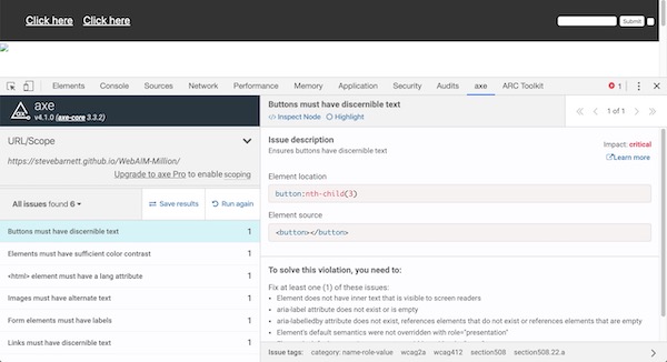
My preferred method: run Deque’s axe browser extension.

Alternative methods:
- run the Fast Pass of Microsoft’s Accessibility Insights Chrome extension. (This runs axe behind the scenes)
- run WebAIM’s WAVE Web Accessibility Evaluation Tool either as browser extension, or using their web interface.
How I check for meaningful text context
My preferred method: use a screen reader (in my case, VoiceOver for Mac OS) and cycle through the groups (of links, buttons, and images). (I’ve also written up how I do more thorough testing with screen readers).
I like using a screen reader for this because it:
- let’s me check that the items make sense in isolation;
- let’s me check that the items make sense as a group;
- gets me practising with a screen reader;
- reminds me that people interact with the web in many different ways.
Alternative methods:
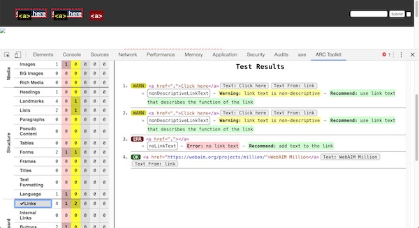
- run Paciello Group’s ARC Toolkit Chrome extension. The ARC Toolkit is great because it’s very detailed. The flip side of that is that it can feel a little “noisy” for this particular, quick-check, exercise. It handily groups items, so you can check links, buttons, and images together.
- manually check each link, button, and image.

Adding extra text for Assistive Tech
When it’s not possible or desirable to change the visual representation of the text, there are still ways to improve links (like repeated “Read more”s).
- Add an
aria-labelledbyattribute that points at a nearby useful thing, such as a heading. - Add extra text and wrap it in a
sr-onlyclass (like H5BP’s sr-only styles) that visually hide the extra text.
Summary
Running a handful of tools and making a few spot checks can result in catching some low-hanging accessibility fruit. Delicious!
Ideally this is just the start, though. When I can spend more time, I do a wider, deeper, set of tests using my accessibility toolbox.