On some of my recent work with the very lovely people over at Code Collective, I had a chance to do a big revamp of a dashboard page. We took a big, complicated, existing dashboard and made it simpler and more more useful. Here’s how we went about it.
Quick bit of background
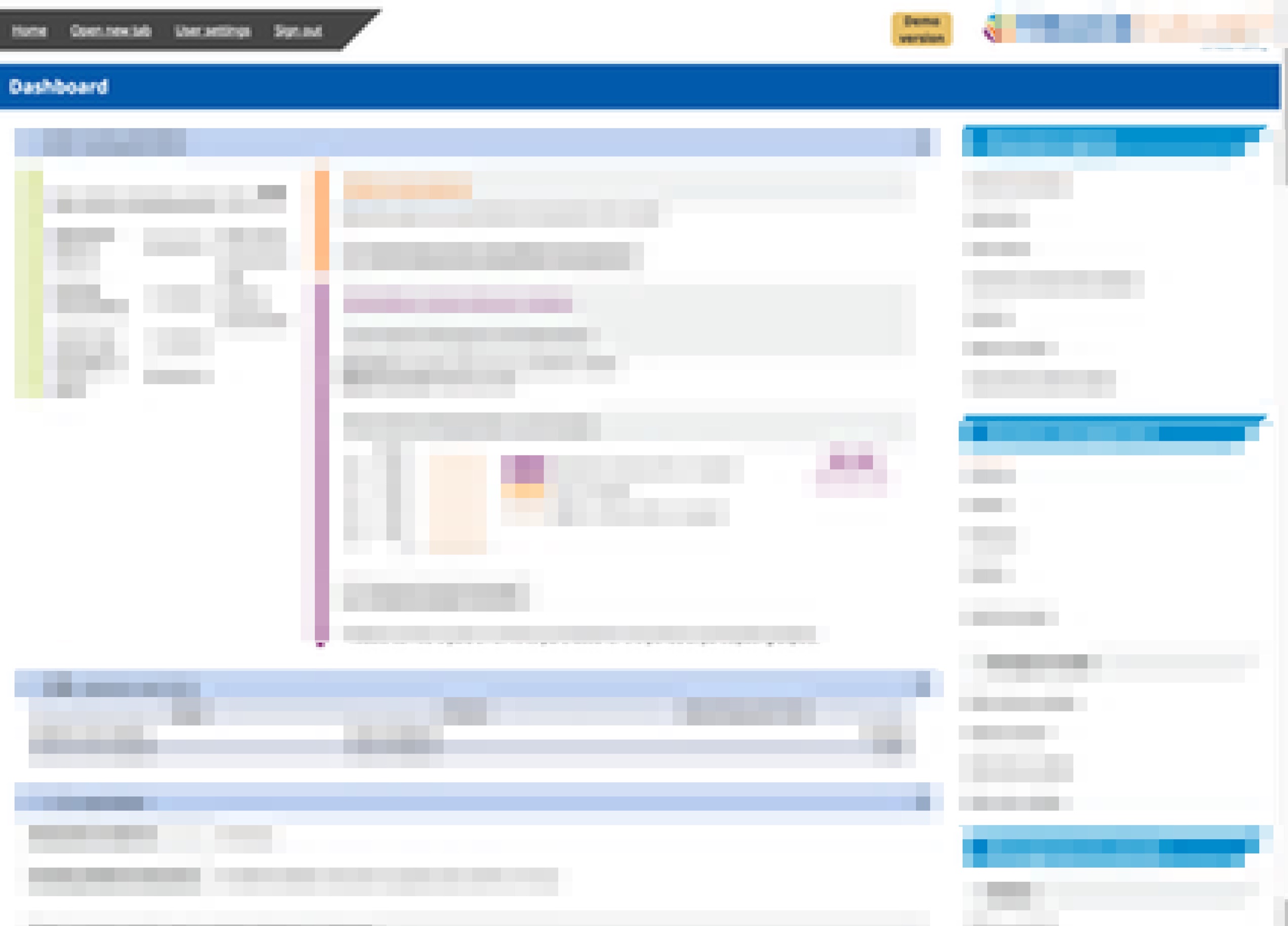
The existing dashboard could be described as “legacy” in a number of ways. The code behind it was from a dated framework. The layout and design was kind of bundled in with the framework (although we’ve made a number of updates to it over the past few months). A bunch of new features were added to it over the years, leading to a bit of feature-bloat.
What makes a good dashboard?
I started by making myself some notes about dashboards. What makes a good dashboard? As is often the case, I like to poke through my bookmarks on Pinboard and get a few different perspectives on the problem.
- Useful, actionable, information.
- Just the critical stuff: errors, warnings.
- If it’s more than one screen, it’s too much.
- Show the right level of detail, and the context of the information.
- Use graphics where you can, to improve communication of the information.
- Watch out for chart junk and overuse of colours.
Cut it up
Our next step was to do a scissors exercise on the dashboard (like you might do when making a design system). We printed out the dash (a couple of bits of A4) and chopped it into pieces.
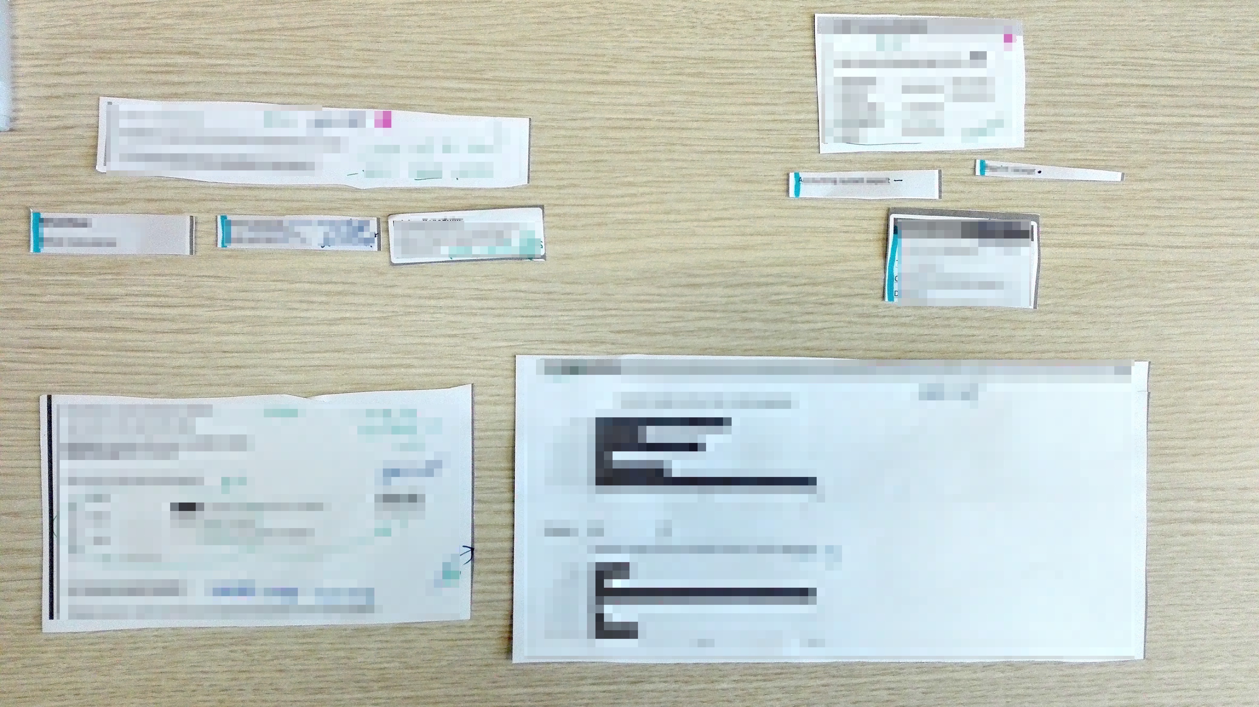
Keeping our “what makes a good dashboard?” list in mind, using it as a filter, we went through the pieces and decided what absolutely must stay on the dashboard. What was important, useful, and actionable enough to deserve a spot there. After that we grouped things, and named them. We did a few iterations of this because it was difficult to let some things go. Every thing there was added for a reason. We needed to take an 80/20 machete to it, though. What do the vast majority of users need to see? What passes our “useful, actionable, critical” filter?
Card it up
We also had an updated look and feel from the design team, so we combined this and our new content strategy and decided on a card-like layout. For me personally this was a chance to play some more with CSS Grid. I really dig how brief, but clear, it is. Here’s our layout code:
display: grid;
grid-template-columns: repeat(auto-fit, minmax(25em, 1fr));
grid-gap: 1em 2em;
The bit that might be a little head-scratch-y is the grid-template-columns: repeat(auto-fit, minmax(25em, 1fr)). That says something like: keep on making every column at least 25em wide, at most 1fr wide.

We used a rule of thumb of “one screen (or less) on a laptop-ish size.” The dashboard is responsive, so “one screen” doesn’t have much meaning, but our rule of thumb was good for keeping the number of cards down.
We needed to make sure that users could still access all the same information as the old dashboard. We decided to do this using “section navigation,” (for example: “account management”) placed in the footer of the cards. This takes the user to the most useful page in that section, with other pages available from a sidebar menu.
Wrapping it up
The end result is a dashboard with a lot less information on it, but a much higher percentage of immediately useful information. That means a lower chance of the user missing something important. It means faster finding of the stuff the user is looking for. Yay! :)