Here are my little sketchnotes from this year’s A11yCamp.
A few things that stood out to me:
- Impairment is part of human diversity.
- This made me think about Technoableism. It made me think about a framing that I like to use: it’s not about those disabled people over there, it’s about us humans over here.
- The unspoken “… and we don’t want them as customers.”
- I don’t think I’d thought about this particular angle / framing before. It’s a powerful framing, but needs to be carefully used.
- Give context to numbers. Reframe to give meaning, impact.
- This made me think about Persuasion and the book Making Numbers Count.
- Users don’t care about labels, they care if it works.
- Truth!
- Literacy, occupation, age, nationality impact needs, accessibility.
- This made me think about the social model of disability and applying it more widely. Things that change needs, change accessibility.

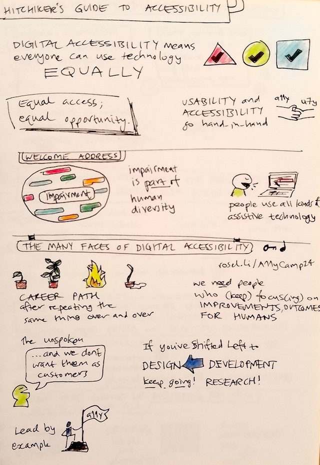
Hitchhiker’s Guide to Accessiblity
- Digital accessibility means everyone can use technology equally.
- Equal Access, Equal Opportunity.
- Usability and Accessiblity go hand-in-hand.
Welcome address
- Impairment is part of human diversity.
- People use all kinds of assitive technology.
The many faces of digital accessibility
- The career path after repeating the same thing over and over is like: a pot plant just starting to grow; a pot plant in full growth; a pot plant on fire; a pot plant in a puddle, just a burnt trunk.
- We need people who keep focusing on the improvements and outcomes for humans.
- The unspoken “… and we don’t want them as customers.”
- If you’ve Shifted Left to Design, keep going! Research.
- Lead by example.

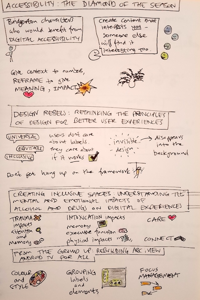
Accessiblity: the diamond of the season
- Bridgerton characters who would benefit from digital accessibility.
- Create content that interests you. Someone else will find it interesting too.
- Give context to numbers. Reframe to give meaning, impact.
Design Rebels: rethinking the principles of design for better user experience
- Universal, Equitable, Inclusive.
- Users don’t care about labels, they care if it works.
- Invisible Design disappears into the background.
- Don’t get hung up on the framework.
Creating invslusive spaces: understanding the mental and emotional impacts of alcohol and drugs on digital experiences
- Trauma impacts and attention and memory.
- Intoxication impacts memory, executive function, physical function.
- Care, Connect.
From the ground up: rebuilding ABC iView Android TV for all
- Colour and Style.
- Grouping labels and elements.
- Focus management.

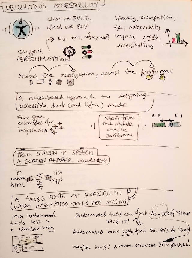
Ubiquitous Accessibility
- What we build, what we buy.
- Literacy, occupation, age, nationality impact needs, accessibility.
- Support Personalisation: e.g. tea, coffee, water?
- Across the ecosystem, across the platforms.
A rules-based approach to designing accessible dark (and light) mode
- Few good examples for inspiration.
- Start from the middle and be consistent.
A false sense of accessibility: what automated tools are missing
- Most automated tools test in a similar way.
- Automated tools can find 20-30% of issues. Flip it! Automated tools can’t find 70-80% of issues!
- Maybe 10-15% is more accurate.

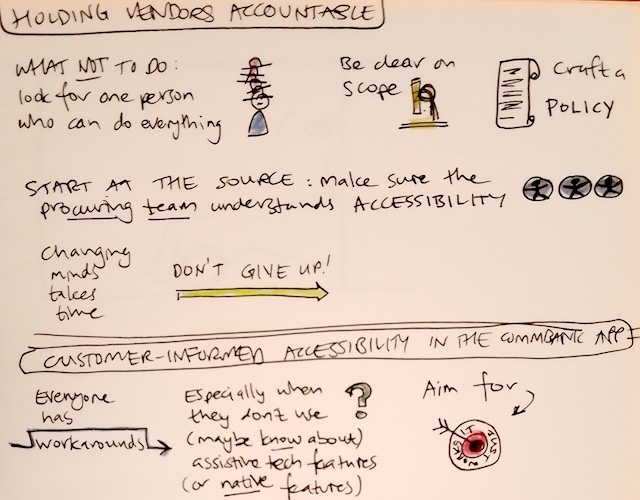
Holding Vendors accountable
- What not to do: look for one person who can do everything.
- Be clear on scope.
- Craft a policy.
- Start at the source: make sure the procuring team understand accessibility.
- Changing minds takes time. Don’t give up.
Customer-informed accessibility in the CommBank app
- Everyone has workarounds.
- Especially when they don’t use (maybe don’t know about) assistive technology features (or native features).
- Aim for “it just works”.