Hi! This is a brief write-up of a 10 minute lightning talk I gave at Code Camp Wellington 2024.

I’m gonna talk about Difficulty levels in Elden Ring and what they can teach us about web accessibility. Elden Ring is a video game made by FromSoftware, a Japanese game company that makes infamously difficult games. Elden Ring, more than any of their other games, allows players to customise the difficulty through means like choice, predictability, and support.
I’m not going to be talking about video game accessibility. There’s lots of amazing things happening there in the past few years especially. For a best in class example check out Accessibility options for The Last of Us Part II and the Verge’s interview with Naughty Dog. But this talk is about examining what Elden Ring does for difficulty, and applying those ideas to web accessibility.

Minor spoiler alert for the first few hours of Elden Ring!
I’ll just be talking about the first area, the first boss or two. Only things you’re likely to see in your first few hours of playing this double- or triple-digit game.
I’‘m going to go through three chapters, each like this:
- The Challenge (in Elden Ring)
- An Approach (to the difficulty).
- Then we’ll zoom out and look at The Wider Lesson (of the approach),
- Then we’ll zoom back in, and look at An Approach (for web accessibility, for us as users and us as makers)
Chapter 1: Choice
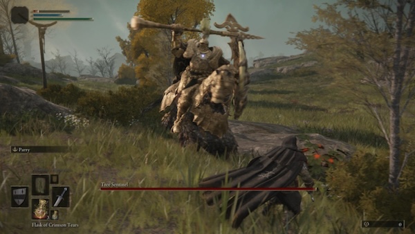
The Challenge: Tree Sentinel
“The living rampart of the Erdtree”.
That’s a great description because this thing is like a big brick wall that is great at slamming, repeatedly, into your face.
It’s the first enemy that most players will encounter. It’s the first one you see after the tutorial area. And it is very good at killing you to death. It is a high difficulty encounter. However! There are many approaches to this fight.
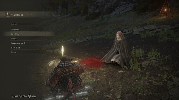
An Approach: choose to come back later!
Go off and explore a bit, fight some less difficult enemies, level up a bit. Come back stronger, faster, with better gear.
Okay, so what’s the bigger idea? What if we zoom out?
The Wider Lesson: allow choice
Let the person decide how they want to approach the thing.
In games that’s player choice. On the web that’s user choice.

An (Accessibility) Approach (as a user)
I can choose a different way to use the interface. I might use my mouse or trackpad. I might use a touchscreen. I might use only my keyboard. I might use my voice. I might use some assistive technology like a screen reader. Or something else!

An (Accessibility) Approach (as a maker, to allow user choice)
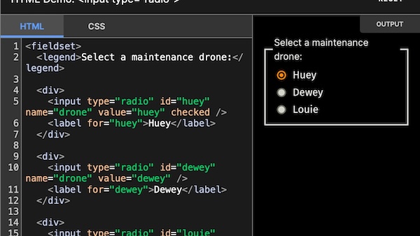
Test with the keyboard. This is excellent “value for money” in terms of testing. And it doesn’t require any special equipment!
Chapter 2: Predictability
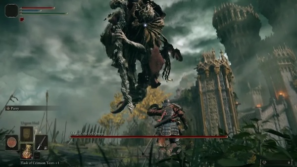
The Challenge: Margit, The Fell Omen
“Put these foolish ambitions to rest”
Margit likes to say this after he’s pounded your face into the rubble, again. Marge, Margaret, Margit here is the first boss that most players are likely to encounter. He guards the entrance to Stormveil Castle, the first big dungeon-y area. And… well, he’s kinda mean. And he’s definitely difficult. But! There are ways we can customise the difficulty a bit.
An Approach: predict the signs
Also known as: learn the telegraphs. When he jumps in the air, he’ll do the big slam thing: run! When he holds his arm high in the air, he’s about to do the sweepy thing: dodge roll!

The Wider Lesson: be predictable
In design circles you might hear people talking about affordance. That kinda means when the form, the shape, of the thing tells you what you can do with it. Like a (well-designed) door. If it has a sticky-out handle, you grab it, you pull it. If it has a flat plate, you out your hand on it, you push. You can predict how it’ll work, what will happen.

An (Accessibility) Approach: (as a user)
Predict what the UI will do based on what it looks / sounds like. If a thing on a page looks or sounds like a link, I predict I’ll move, probably to a new page. If a thing on a page looks or sounds like a button, I predict some action will occur when I press it.
An (Accessibility) Approach: (as a maker, to allow users to predict)
Use conventional UX and UI. As a designer that means used well know patterns and interactions. As a developer that means using semantic HTML, like button elements for buttons!
Chapter 3: Support
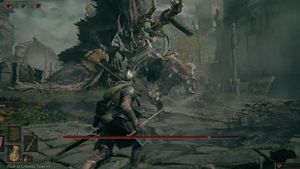
The Challenge: Godrick the Grafted
“Thou’rt unfit even to graft…”
If you’ve played the game, you’ll know that that is, as the kids says, a “sick burn.” Rickroll here is the first major boss. He has far too many arms for a person, and he likes to hit you with all of them. What a jerk!
But… can you guess what’s coming? We can customise the difficulty by choosing a different approach.

An Approach:
Summon Spirit Ashes for support. They’re computer-controlled helpers. You ring a bell, they appear, they help!
Like these three very good dogs. They’ll pop out, run after Godricky Martin and bite his butt. Hooray! They won’t win the fight for you, but they will help a lot.

The Wider Lesson: use support
In particular, robot support. Technology support. Maybe super fancy GenAI something something, but it doesn’t even need to be that complicated.
Okay, let’s zoom back in.

An (Accessibility) Approach: (as a user)
We might use the Use Reader view of our browser, to strip out most of the busyness and noise and just give us the text, the structured content. Or we might use “Read this page” to hear it rather than look at it. And there’s lot of assistive technology that is even more cleverer!
An (Accessibility) Approach: (as a maker, to support the robots)
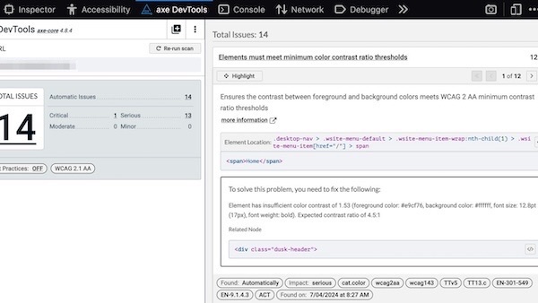
Use Deque’s axe. This is an engine for testing for common accessibility errors. things like colour contrast and accessible names for things.
If you’re a developer, you can stick in your automated tests: unit, integration, or end-to-end. If you’re a designer or product person you can grab their Browser extension, which runs basically the same test on any page you can open in your browser. Nice!
Quick recap

- Choice! Test with the keyboard.
- Predictability! Use conventional UX.
- Support! Use Deque’s axe.
Thank you! 🙇
Short URL: naga.co.za/ccw24