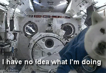
Today I gave a talk at the Cape Town Front-end Developers meetup group on the hamburger icon. Here’s a write-up of (some of) what I said. I’ve collected a list of burger-related links on my Pinboard account, tagged burgergate.
I believe burgers are bad and that we can do better. Well, really I mean blindly using the burger is bad: we should be making informed choices and doing what’s best for our users. I’m going to talk about both the hamburger icon and the off-canvas navigation pattern and kind of moosh them together a bit.
But first a quick disclaimer: I am not the most expert-est at this.
I’m learning things every day, and there are plenty of people who’ve learnt more than me. This is just what I think, based on what I’ve seen.
I’m going to present my case in three courses: a starter of Mystery Meat (of mobile navigation); a main course of (Bad) Burgers (where I explain why I think burgers are bad); a desert of Mixed Grill (some examples of alternatives).
Starters: Mystery Meat
Let’s start with the origins of the burger icon. Like so many things in life, it starts with a photocopier.
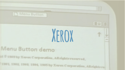
They just made up the icon. It was on a User Interface that had lots of windows, so they lol/jk-ed that it was an air vent. Then the icon went to sleep for many years, and woke up fairly recently in the iOS edition of an app called Path. Then Facebook started using it. And now it’s everywhere.
But it’s not just the burger. We’ve got Cheeseburgers, Meatballs, Kebabs (or Espetadas if you prefer), Kebab and fries (plus the flipped version), Doner kebabs, Bento boxes, Back Burgers, People Burgers (Soylent Green is people!). All this mystery meat is confusing.
Mains: (Bad) Burgers
But before I launch into my rant, it’s good to remember that every coin has two sides. There are some good things about the burger.
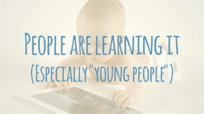
People are learning it. Because it’s cropping up everywhere, people are starting to recognise what it is.
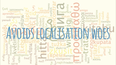
Because it’s just an icon, you can avoid localisation woes: no translating into 17 languages for you: just one icon and you’re done!
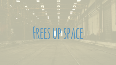
And it frees up space. You can have content first, navigation second; if you have lots of items in your navigation, you don’t need to worry: they can all go into your navigation drawer.
Well, while these are all kinda true, I have a but. A fairly big but. It’s time to look at the other side of the coin.
The Icon
What does it mean? This is the flipside of “People are learning it.”
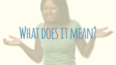
Some users are learning it, yes. Lots haven’t yet. They ignore it. They don’t know what it means because it has no real-world analogue. And as you may have read on the internet:
A user interface is like a joke. If you have to explain it, it’s not that good.
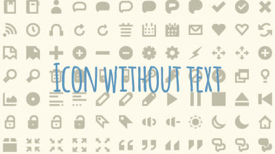
It’s an icon without text, so it breaks the “Don’t make me think” rule. The meaning is not immediately clear.
The Pattern
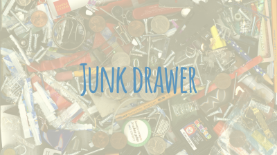
The flipside of “It frees up space” is the Junk Drawer. You’ve got this out-of-the-way space so you can put anything you like there. You’ve got loads of room: you don’t need to worry about prioritisation or arguing if you really need 17 sub-categories.
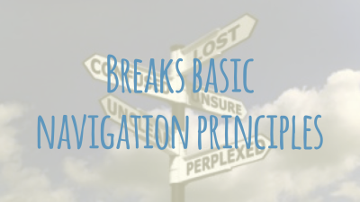
A big one for me is that it breaks basic navigation principles: it doesn’t show you where you are, or where you can go.
Dessert: Mixed Grill
The Icon
Let’s look at ways we can improve our burgers.
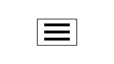
Here’s our regular burger again.
What can we do to make it better? Well, floaters are the worst, so let’s button-ise that sucker.
Now it looks like a button: a thing you can interact with. Already it’s better. But we can do more: let’s add a label to the icon:
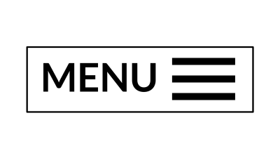
Now the button has some context. People don’t have to guess what the button is for: they can see!
The Pattern
Let’s look at a few ideas for better patterns.
Here’s Contents Mag. I’ve chopped the middle out for easier viewing of the whole page.
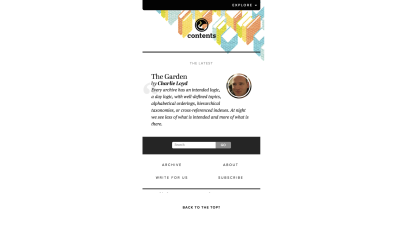
They use a footer link.
Pros? It lets them put content first and navigation second. Also, this pattern works on every single device, ever.
Cons? Not much. You could argue that it’s not very flashy and fancy, I guess.
What about Facebook?
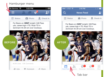
As Luke W wrote: They ditched their burger when they saw “engagement” plummet. They switched to a tab bar. You can use one at the top or bottom, the positions can be fixed on screen, one be part of the content. And it’s changed again since this pic.
You can see they couldn’t completely ditch their burger habits, though. They have a person burger, and a regular burger: at least it’s labelled.
Pros? You can see where you are, and where you can go. You can switch quickly and easily.
Cons? They have a lot of navigation. It takes up screen space that could be used for content.
Let’s look at the Guardian in the UK.
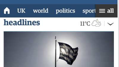
Let’s be honest: it’s a bit confused. It’s got this horizontal scrolling thing for the navigation, which is cool. It also uses what people are calling the Priority Plus pattern: squeeze in what you can, but have quick access to the rest via a “more” or “all” link. But it also has a burger.
Pros? Good for touch screens. It’s a news site, so people expect lots of nav items. It has a labelled burger.
Cons? Depending on spacing, it might not always be clear that there are more items.
Let’s look at gov.uk (And not just for some foregone travel advice).
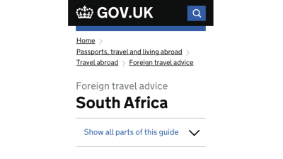
This does something radically different: straight up Breadcrumbs.
Pros? You can see where you are and where you can go. Search: people <3 searching on mobile.
Cons? Breadcrumbs take up a lot of space.
Last but not least, let's look at Apple's recently redesigned site.
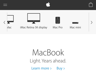
They use an equalsburger instead of the regular three-piece, which hides away the main categories. The sub-categories are show as text with icons, and are in a horizontal scrolly thing. An interesting mix of splitting up your navigation, but it still puts navigation first and content second.
(Bad) Burgers: Processes
This solution is a really good one, but not easy or quick: Review your Information Architect.
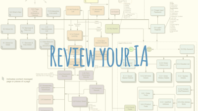
It will force you to focus, especially if you adopt a Mobile First approach. It’s kind of the flipped of the junk drawer.
And maybe the most important thing: whatever you do, do User Testing. And do it early and often.
Conclusion
Burgers can be bad and we can do better. Make informed choices and do what’s best for your users.