A few weekends ago, I gave a talk about squishy things to the atteendes at UX South Africa 2014. It was equal parts terrifying and exhilarating! I took notes from all the talks, and wrote up some from day one and day two. Here’s a write-up of the talk I gave. (Warning: long post is long)
The alternative title for this presentation was Mobile First Progressively Enhanced Responsive Web Design, but I thought that sounded very technical and kind of dull, and what I actually wanted to talk about was being squishy.
Being squishy, thinking squishy, and especially designing and developing squishy. You could call it Wibbly Wobbly, Flux-y, Adaptive, Change-y. The important thing to remember that screen size is just one aspect.

A whole bunch of links related to the stuff here, plus a link to the slides is up at naga.co.za/squishy. I’m on Twitter as @maxbarners for feedback or heckling. My day job is working as a Front-end developer at Praekelt. We create mobile experiences for the majority world, which means we do a lot of cool stuff with low-tech phones.
What is a Front-end developer, and where do they come from? Here’s a dramatically over-simplified diagram: Back-end developer, Front-end developer, Designer, going from left to right.
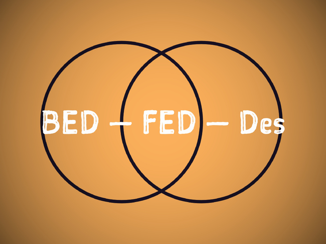
In the beginning, there were back-end developers, and it was good. That sat in dark basements, making stuff on the world wide web, surround by the warm glow of their blinkenlights, wading through a floor full of empty cans of Red Bull. At some point, someone said: “Hey. People are using these sites and apps and things we’re building. Maybe we should get some designers involved to make it work well and look good.” Then came a bit of a Mexican Standoff. The developers and designers didn’t really speak the same language, or care about the same things.
But one day came a person who was the unholy union of both of these: the Front-end developer. The overlap varies, but all FEDs have some developer skills and some designer skills. As you can see from the slides, I veer more towards the developer side of things.
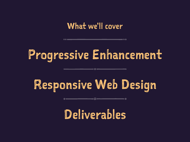
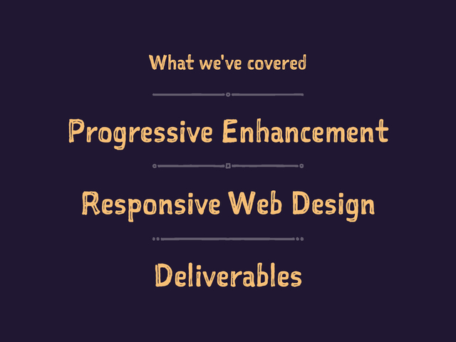
We’ll cover Progressive Enhancement (PE), Responsive Web Design (RWD), and Deliverables. We’ll spend most of our time of PE because it’s the most important bit, and it feeds into the others.
We won’t cover Workflow or Tools. Workflow is a big, complicated, topic that could be several long lectures of its own. We won’t talk about Tools because I don’t care what you use, as long as you’re happy with it.
First up is Progressive Enhancement.
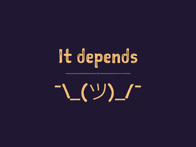
It makes me feel all warm and fuzzy inside. In fact, this is how it makes me feel:

What is about? It’s about diversity. It’s about dealing with unknowns. It’s about not having to worry when things go wrong. That’s all a bit vague. What actually is it?
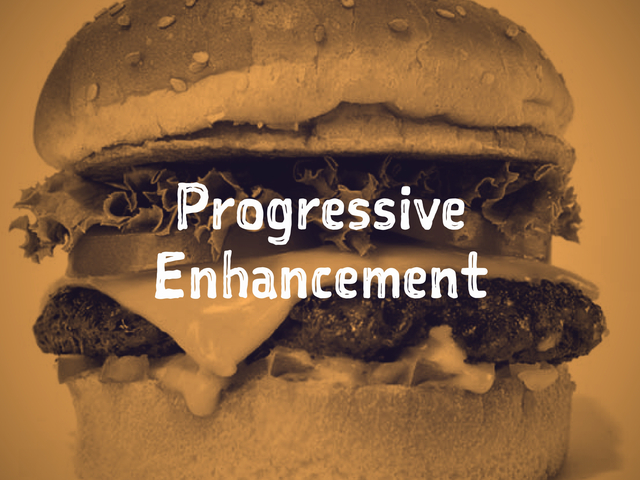
It’s about building your web site in layers, like a tasty cake-burger or burger-cake. You start with a simple, functional, baseline, then enhance. Progressively Enhance, if you will. You add layers of tasty goodness on top of your baseline, enhancing the experience with each layer.
The way it works is by asking questions of the browser. Do you know how to do This Thing in JavaScript? Cool, have this extra bit of code. No? Don’t worry about it then: you’re good as you are.
It lets you start functional, and build up to something fancypants. To really get a grip on it, let’s look at how an internet web page is made up.
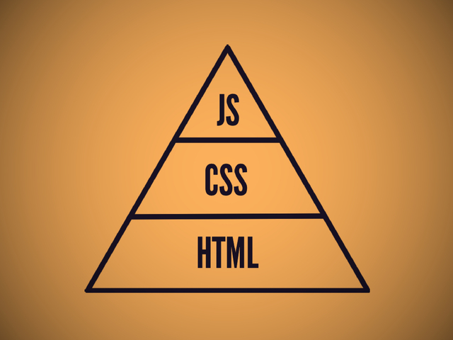
At the bottom, you have your HTML: the structured content of the page. Headings, paragraphs, images, videos.
On top of that you have your CSS. This handles the presentation: colours, fonts, layout. Note that it’s a separate layer: see, there’s a black line there and everything. It exists apart from the structure and content (the HTML) of the page.
At the very top, in the tiny triangle, is the JavaScript (JS). This adds behaviour and interactions to the page. It’s also the most fragile part. An error in the code (perhaps introduced at midnight by a sleepy developer as a “quick fix”) can break the whole block of the JS.
An important part of PE is learning not to depend on JavaScript for functionality. Sure, use it for enhancing the experience and making it better, but don’t depend on it. People sometimes argue this point: “most people don’t turn off JavaScript.” This is true, but that’s not what we’re guarding against: we’re on the watch for technology (or developers!) failing. And if you have a page with a big bit of JavaScript it will take a while to download: all your users are non-JavaScript users while that’s downloading.
Let’s look at a small, specific, example, and just with a bit of CSS.
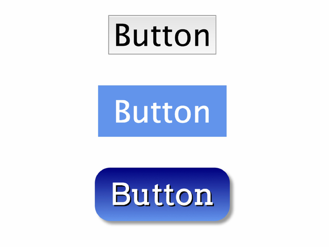
The top one is just the plain HTML, not CSS. It doesn’t look particularly snazzy, but it does the job. People will look at it, know it’s a button, and press it. Let’s add a little CSS for the middle one: Now we’re getting somewhere. Looks a bit better. Now let’s go full-on Web 2.0: add some a drop shadow, a gradient, a special font. Now this looks “great.”
The thing is, this enhancement isn’t a straight line: it’s all granular. A particular user’s browser might understand the fancy font and the shadow, but not the gradient or the rounded corners. Or the browser might understand all of it, but the font fails to load for some reasons. Each aspect of the presentation can be on or off. Very squishy.
Now let’s look at a bigger example, from top notch folks Filament Group.
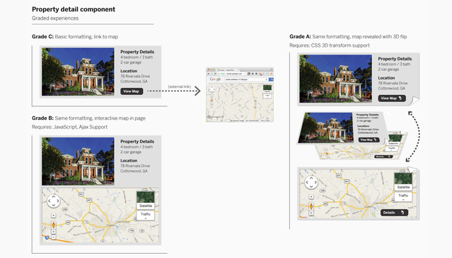
This is a property listing, and we’ve decided we want to add a map to it, to let users easily find the place. In the most basic example, we have a link pointing to a Google map. That’s great! It will work on every device everywhere.
At the next level, we ask questions of the browser, then based on the answers, we load the map underneath the listing. Even better. We’ve enhanced the experience and now the map is right there with the listing.
If the browser is super good, we can get really fancypants. We use some snazzy CSS and do a flip flop with the map and the listing detail: animations and things.
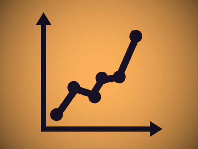
Here’s a chart with Capabilites of the browser along the bottom (the x axis) vs Fidelity of experience along the side (the y axis). Generally speaking, as the browser capabilities increase, the fidelity of the experience increases: we apply layers of enhancement. But it’s not a smooth line: each enhancement is granular.
Let’s back up again and think about our web page triangle and cake-burgers, and I’ll try and use an “analogy.” Let’s say I want to go from the ground floor to the first floor of a building.
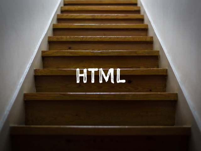
The HTML would be some plain stairs. Not great to look at, but they do the job. Let’s apply some CSS: add some presentation to the experience.
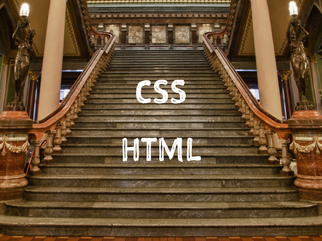
(This is a picture of my house in Observatory, of course.) Ooh, now we’re looking good. But don’t forget that the presentation layer is separate. it doesn’t matter what the stairs look like: I can still get to the first floor.
Now what happens when we apply some extra enhancement?

Great! Now it looks good, and the experience of getting from the ground floor to the first floor is fun too. The thing is: that JS at the top of the triangle is the most fragile part, remember? So what happens when some thing goes wrong, when the JS fails?
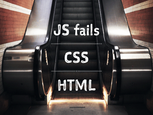
Actually it’s not so bad. They kinda become stairs again.
But what if we approached this problem differently? What if we relied on the JS layer to get from the ground floor to the first floor? That would pretty much be an elevator. So what happens when the JS fails for an elevator?

It’s not so great.
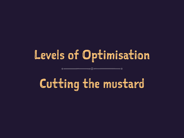
There are levels of optimisation to consider, though. It’s important to know who your users are, and what they’re using. I’m not suggesting that you spend months and months of time designing and developing for the oldest BlackBerry on the market if you’re making something for a small group of Investment Bankers with the latest iPhones. There’s no reason you can’t start simple and add on layers of enhancement, though.
And you can draw a line in the sand. The team at BBC News do something they call Cutting the Mustard. They made a call about the modern-ness of browsers that they deliver a high-end experience too. They want to take advantage of new technology to write less code and therefore give a faster experience to users.
To deliver an identical experience to lower-tech browsers would mean writing a lot of code, and delivering a slower experience. Fast trumps fancy, especially here: people come to read the news and look at the pictures, not to marvel at the new carousel.

For me, this leads into the idea of the One Web: the idea that everyone should have access to the web, regardless of the device they’re using, the connection they’re, or any disabilities they might have. Sir Tim Berners-Lee, the creator of the web, often says awesome things like “The power of the Web is in its universality.” Web pages and cat pictures for everyone, everywhere!
That’s a lot of unknowns, though. Ouch. Good thing we build with Progressive Enhancement, isn’t it?
So: that was some squishy stuff. We talked about squishiness in terms of fidelity: start with a simple, functional, experience and build up to something fancypants. We talked about squishiness in terms of browser capabilities: there’s a wide range of devices out there, and they can all do a mix of different things.

Ok, now let’s talk about Responsive Web Design (RWD). It’s made up of three key parts:
- fluid grid
- flexible images
- media queries
The squishy bit of it is layout: most usually chaining the number of columns. You might have three columns on your desktop layout, dropping to two columns for a tablet kind of size screen, then having just one column on a small mobile screen.
An important thing to keep in mind is that it’s about proportions, not pixels. A two column layout would have each column at 50% width, not at a fixed pixel amount.
Another important things is that it’s not about this (doing the responsive shuffle):

It’s about this:
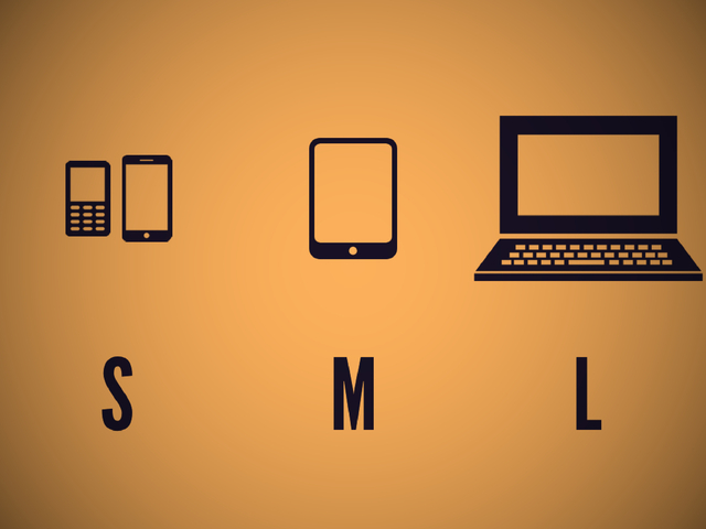
I’ve put just a few here, but this is actually a continuum. On the far left, at the small screen end, we also have stuff like Google Glass, the Apple Watch. And at the far other end, we have things like giant desktop monitors and Smart TVs.
I’ve used t-shirt sizes because the categories are vague, and the borders are blurry. These days, especially between the S and M categories: tablets are getting smaller and phones are getting bigger. And please don’t say phablet.
It gets worse from here. People use these different screen sizes sequentially: you might look up something you want to buy on your phone while you’re waiting for the bus, then buy it on your desktop computer once you get to work. And people use multiple screens at the same time. You’re lying on the couch, watching a movie, and you recognise an actron. You grab your phone and look them up: “Oh yeah, they were Cop #3 in Spider-man 2.”
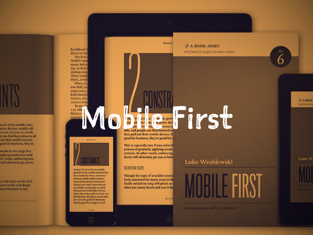
Next came a new flavour: Mobile First RWD. Luke W was talking about Mobile First design and development a few years before RWD was a thing. One of the main things is that the constraints of mobile force you to focus.
Mobile First applied to RWD means starting with small screens and working your way up to larger screens. This is great! It’s basically PE applied to screen size: you treat screen space / layout as an enhancement.
Then things got a bit noisy. All kinds of Firsts came out.
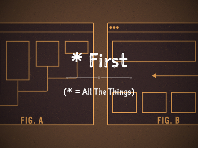
"Content First!" they said. The content is what people are coming to our sites for, let’s use that as our guide. No, wait: "Structure First!" they said. We don’t need to know exactly what the content is, we just need to know the shape of it: heading plus text plus image, and so on. Some cad on twitter suggested Watches First. Now people are shouting Thumbs First. And in developer circles, we’re talking about Performance First: make things fast (and furious) first.
Phew! That's a lot of things to do First.
So that was a whole bunch more squishy things. Size can be squishy. Layout can be very squishy: number of columns, moving things around the page.
Last but not least, let’s run through some Deliverables.
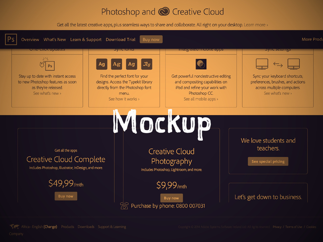
I can’t talk about deliverables without mentioning the mockup, the full page comp. It is not squishy. Photoshop (or your tool of choice) has its place in today’s webby world, but it’s not for creating full page comps. A mockup is fixed size and fixed fidelity, so it can’t represent the squishiness of a web site.
A graphic design deliverable that is a bit squishy is set of Style Tiles.
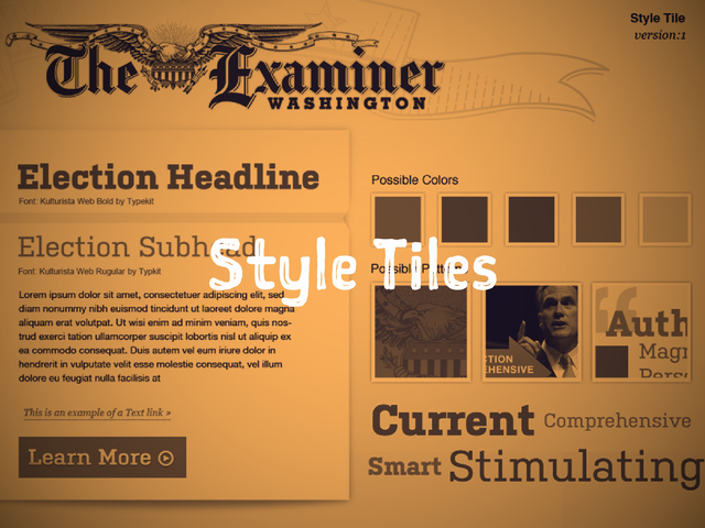
You do bits and pieces of pages: not whole pages, and you don’t worry about layout yet. Style Tiles sit somewhere between mood boards (which are a bit too vague) and mock ups (which are too precise). They often come with an adjective or two to help capture the feeling (corporate or friendly or bright).
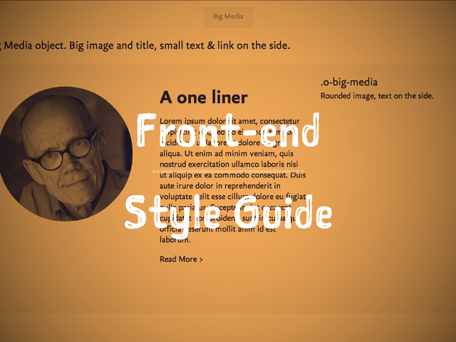
If you start thinking about code at this point, you’ll likely look at something like a Front-end Style Guide. It starts a bit like a Style Tile, but in code, then starts making collections of bits of pages. They come in various flavours, and are some flavours of them are called Pattern Libraries.
If you keep thinking in this bits and pieces way, you’ll to something like Brad Frost’s Atomic Design. You start with the tiniest pieces of web pages, then keep combining them until you get a whole page.
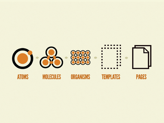
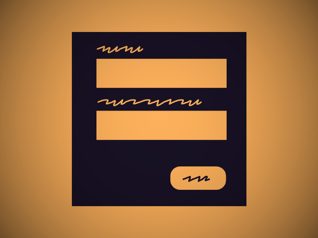
Let’s look at an example: an everyday log in form.
Here, the password field is an atom. The label above it, saying “password” is also an atom. So is the button.
A molecule is a collection of atoms, so here we would have the label and the input as a molecule.
An organism is a combo of these, so here it’s the whole form.
If this way of thinking in modules and bits floats your boat (and it should, because it’s very squishy), you’ll start thinking about Style-Guide Driven Development.

It focuses on components and reusability. That’s very squishy.
So, that was even more squishy stuff. We talked about how even graphic design deliverables can be squishy, and about how code can be squishy too.
And that’s a wrap.
We talked about Progressive Enhancement (squishy), Responsive Web Design (squishy), and Deliverables (squishy).
Now, go forth and be squishy.
And if you have any questions: