Even though most sites are moving away from the traditional silos of a mobile site and desktop site, towards one responsive site serving all devices, we’re still using a lot of legacy terminology, and I’m wondering if that can’t help but affect the way we think about the whole process.
We can keep using mobile and desktop as handy verbal shortcuts for small screens and large screens, but we need to be careful about thinking of them as fixed, solid, specifications. If we want to keep using these terms, we need to think of mobile and desktop as names of buckets, of general classifications for a range of devices.
Mobile
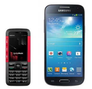
Mobile can mean anything from a Nokia 5310 XpressMusic up to the latest Samsung Galaxy S5. The Nokia has a 240 x 320 pixels screen that’s 2.1 inches, whereas the S5 has a touchscreen with 1080 x 1920 pixels at 5.1 inches.
Desktop
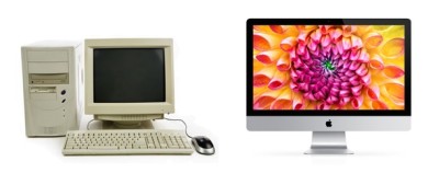
Desktop can be anything from an old desktop machine in an internet cafe running Windows XP and IE6, up to the latest iMac. The old internet cafe machine probably has a 14 inch CRT monitor, precariously balanced on a wobbly desk, whereas the iMac is 27 inches and probably sitting on a big, fancy, desk.
Continuum
Each of these devices, and all the ones between and around them, sit on a continuum. Screen size is just one of the dimensions that change the experience of using a device, but it’s the one we can understand most easily and show most obviously.
Other dimensions are CSS support, JavaScript support, input methods (touch and / or keyboard), hardware quality (how fast is the processor, how much memory does it have, and so on), age and quality of hardware. (There’s a whole other line of discussion around how Photoshop comps and mock-ups can only give us a point on one of these dimensions, but that’s for later.)
Different names for different things
I like to use t-shirt sizes when naming my breakpoints for a responsive site: S, M, L, XL. These are broad enough to cover wide sections of the continuum, and don’t use words that already have strong associations with existing tech. That means it’s good for developers and clients to stop them falling back in to old habits of putting things into silos.
Axure prototypes and Photoshop documents have their place, but we tend to do only two, at the far ends of the screen size continuum, and call them mobile and desktop. These deliverables are signposts for us to fill in the rest of the continuum. I think we need to move away from that, though. We need to steer ourselves and clients towards keeping in mind the whole continuum when we’re designing and developing. That’s why I prefer saying small screen and large screen rather than mobile and desktop.