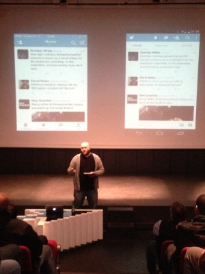
Cobus’s was fast, but clear, and delivered lots of ideas and thinking in a concise manner. There was a lengthy discussion after the talk that was very interesting. He looked at the design decisions made by teams on three big applications: Gmail, Twitter, and Slack.
The three apps take quite different approaches to the problem, but they have some things in common. iOS tends to simplify the interface, and space things out more. Android interfaces tend to be quite compact, with more things exposed to the user by default, and allowing you to dig deeper.
There are also subtler differences in emphasis. iOS tends to prioritise search, and give it more screen space. Gmail in iOS has a row for the search bar and button, whereas Android only shows the icon. Both make use of navigation drawer / off-canvas menus, but their implementation differs slightly. On iOS, the off canvas menu pushes the main content to the side. On Android, the off canvas appears on top of the main content, which becomes dimmed out, and the top bar with account name stays across the whole screen.
Check out meetup.com/ctfeds for Front-end and UX-related talks every month.
