Last week and the week before was A11y Camp. Yay! Below are sketchnotes I made for some of the talks, with my top takeaway for each.
Day one
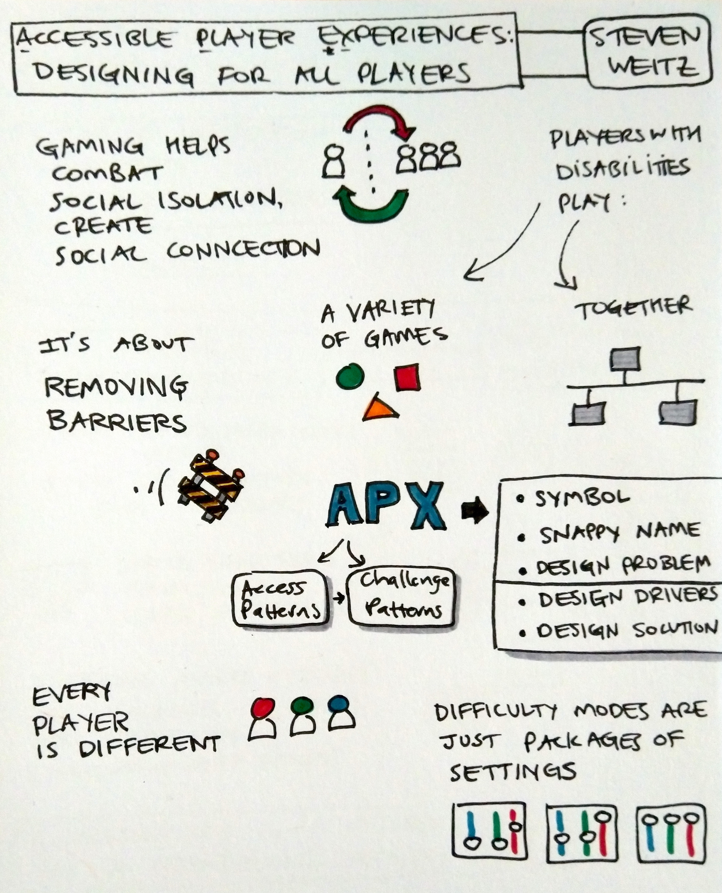
Accessible Player Experiences - Designing For All Players by Steven Weitz
Text version of sketchnotes for "Accessible Player Experiences - Designing For All Players"
- Gaming help combat social isolation, create social connection
- Players with disabilities play: a variety of games; together.
- Every player is different.
- It’s about removing barriers.
- APX (Accessible Player Experience) has Access Patterns and Challenge Patterns. The format:
- Symbol
- Snappy name
- Design problem
- Design drivers
- Design solution
- Difficulty modes are just packages of settings.
My top takeaway: difficulty modes are just packages of settings. Make granular settings first, then package them up together if it helps.
“Accessible Player Experiences - Designing For All Players” video on YouTube
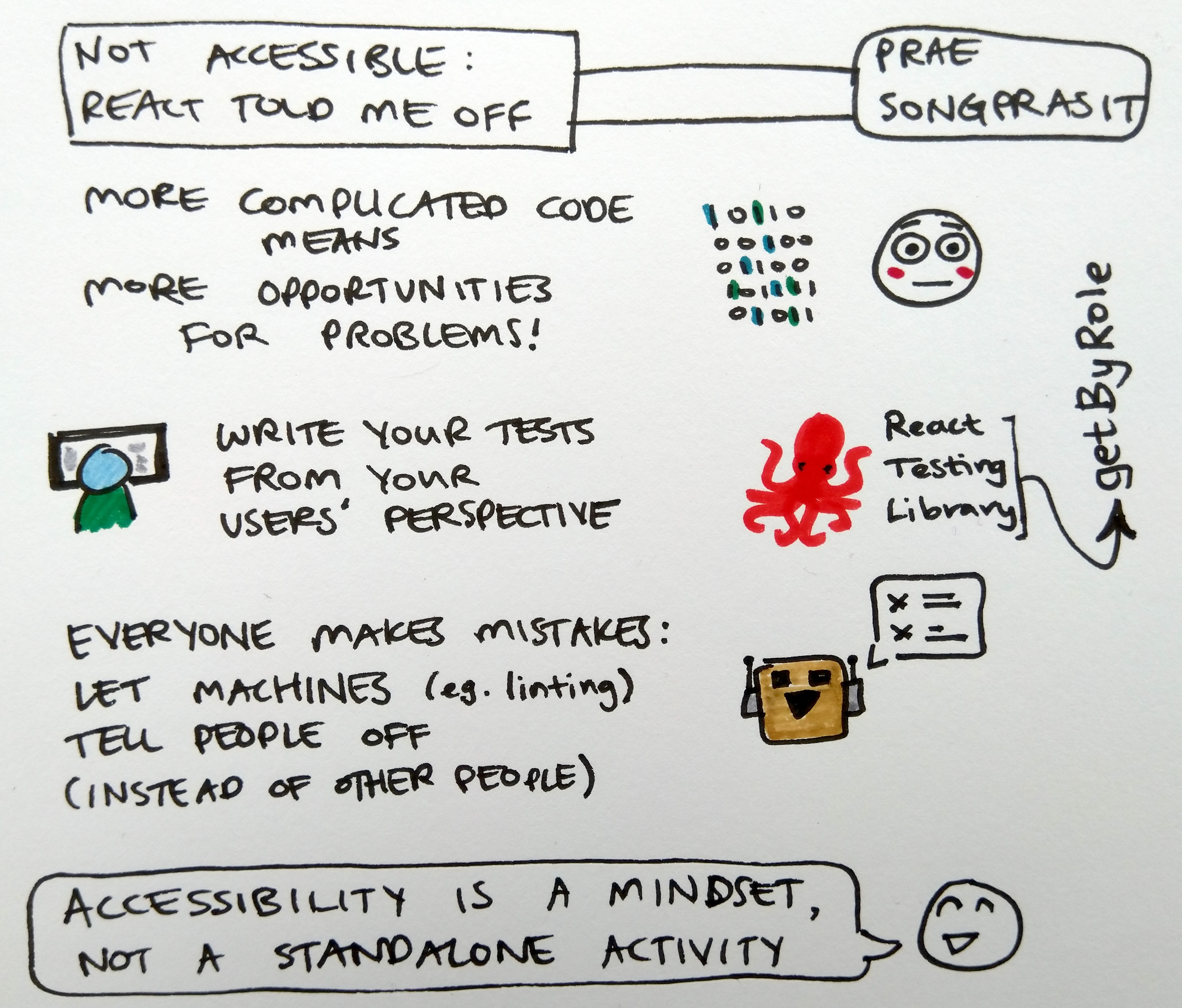
Not Accessible - React Told Me Off by Prae Songprasit
Text version of sketchnotes for "Not Accessible - React Told Me Off"
- More complicated code means more opportunities for problems.
- Write your tests from your users perspective.
- Everyone makes mistakes: let machines (e.g. linting) tell people off (instead of other people).
- Accessibility is a mindset, not a standalone activity.
My top takeaway: let machines tell people off instead of other people.
“Not Accessible - React Told Me Off” video on YouTube
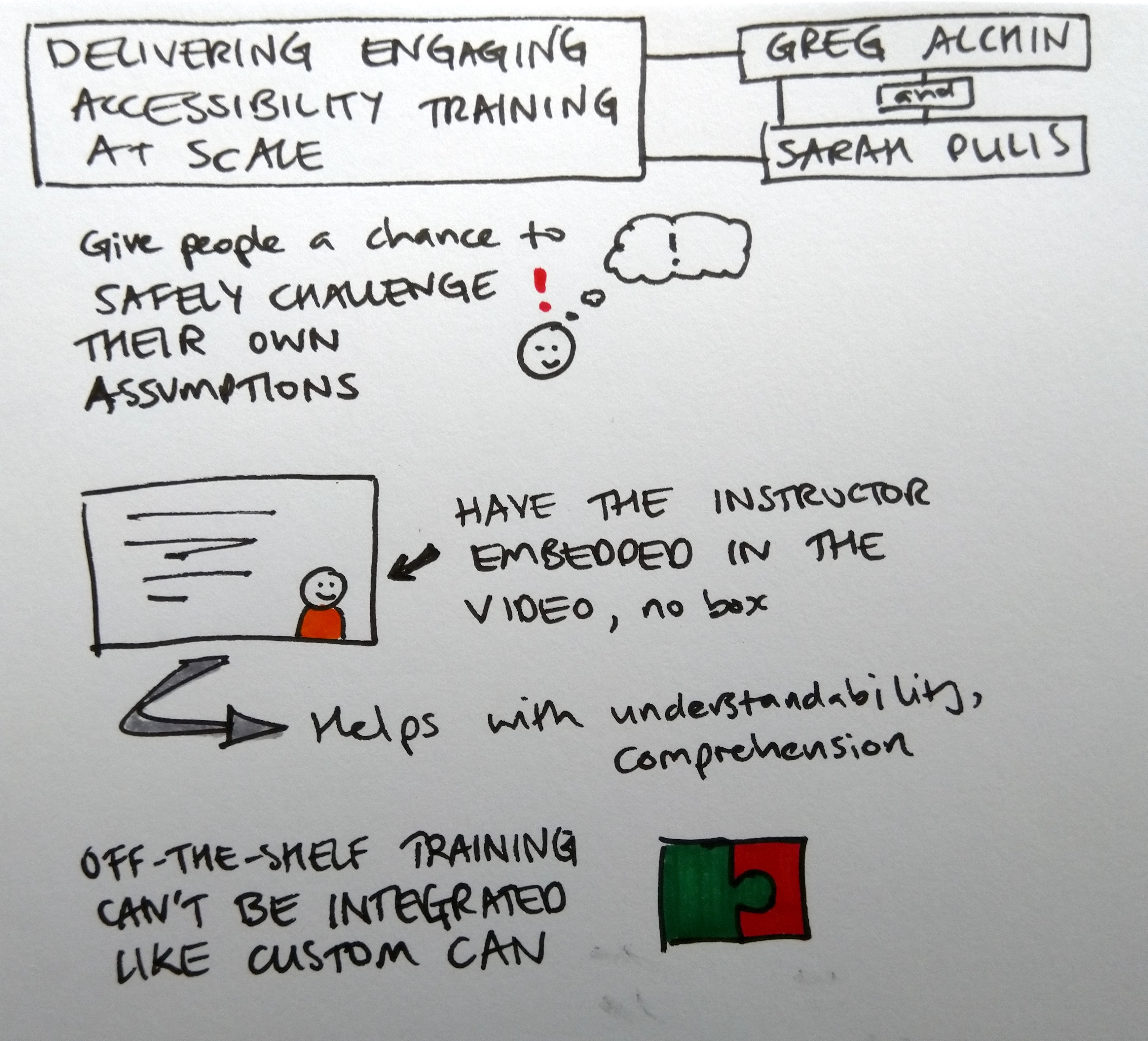
Delivering Engaging Accessibility Training At Scale by Greg Alchin and Sarah Pulis
Text version of sketchnotes for "Delivering Engaging Accessibility Training At Scale"
- Give people a chance to safely challenge their own assumptions.
- Have the instructor embedded in the video, no box. It helps with understandability, comprehension.
- Off-the-shelf training can’t be integrated like custom can.
My top takeaway: give people a chance to safely challenge their own assumptions.
“Delivering Engaging Accessibility Training At Scale” video on YouTube
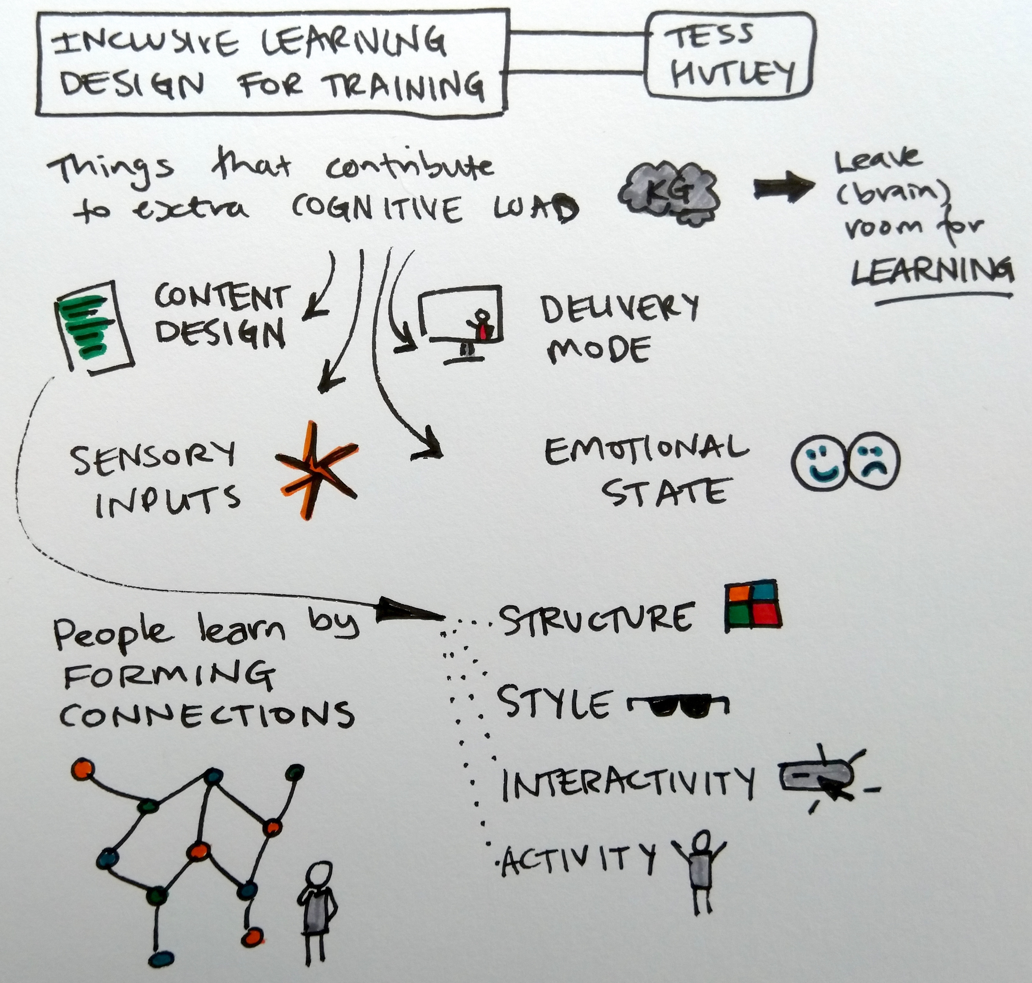
Inclusive Learning Design For Training by Tess Hutley
Text version of sketchnotes for "Inclusive Learning Design For Training"
- Leave (brain) room for learning.
- Things that contribute to extra cognitive load:
- content design
- Structure
- Style
- Interactivity
- Activity
- sensory inputs
- emotional state
- delivery mode
- content design
- People learn by forming connections.
My top takeaway: people learn by forming connections.
“Inclusive Learning Design For Training” video on YouTube
Day two
Mobile Accessibility Testing - Making It Effective And Efficient For Everyone by Rob Whitaker
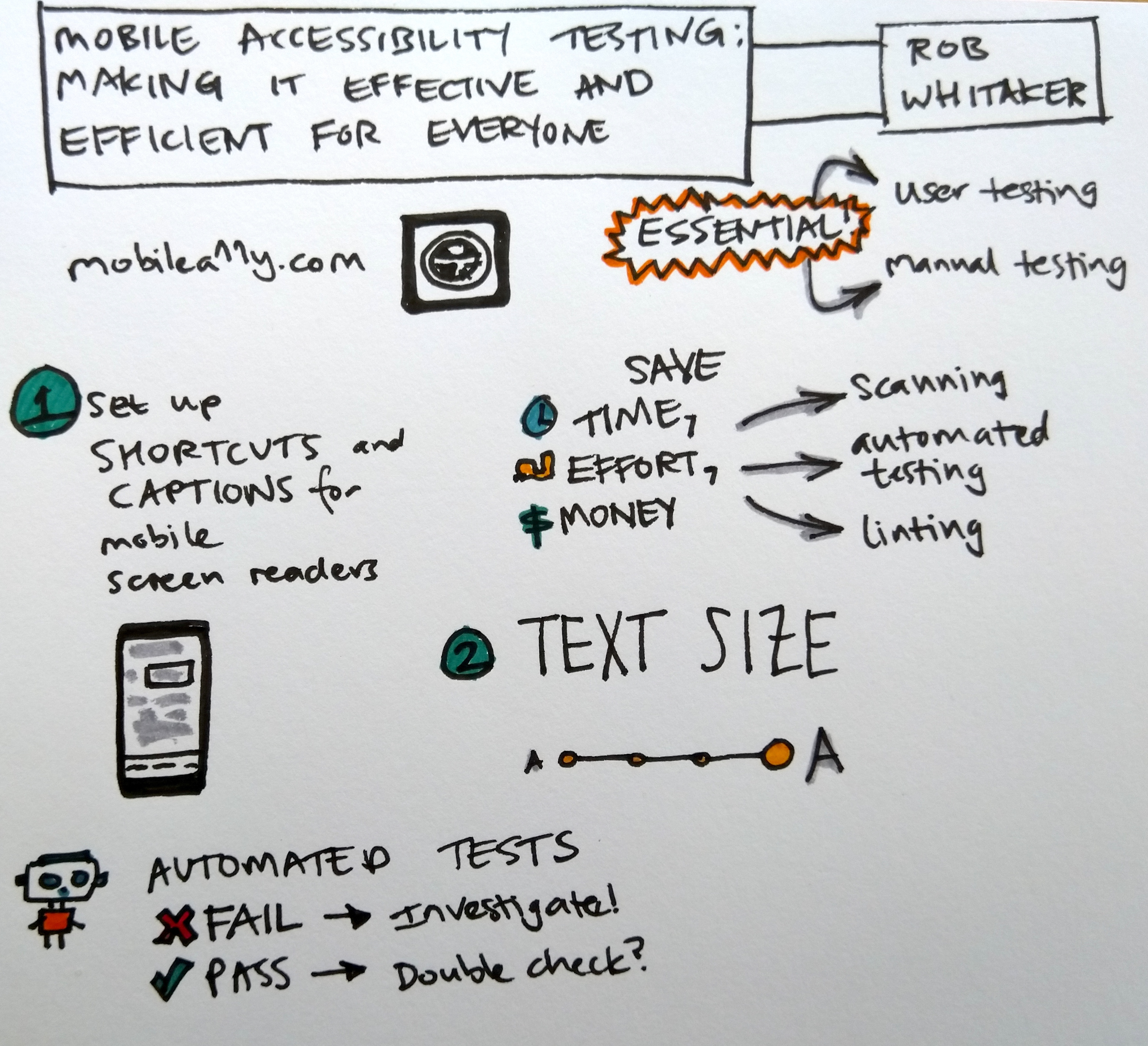
Text version of sketchnotes for "Mobile Accessibility Testing - Making It Effective And Efficient For Everyone"
- Mobile A11y.com
- Essential testing:
- User testing
- Manual testing. Set up shortcuts and captions for mobile screen readers.
- Testing that saves time, effort, and money:
- Scanning
- Automated testing
- Linting
- For automated tests:
- Fail? Investigate!
- Pass? Maybe double-check.
My top takeaway: treat automated test failures as flags for things to investigate.
“Mobile Accessibility Testing - Making It Effective And Efficient For Everyone” video on YouTube
Paying Down Your Debt, Third Party Ui Controls, And Accessibility Half-truths by Ross Mullen
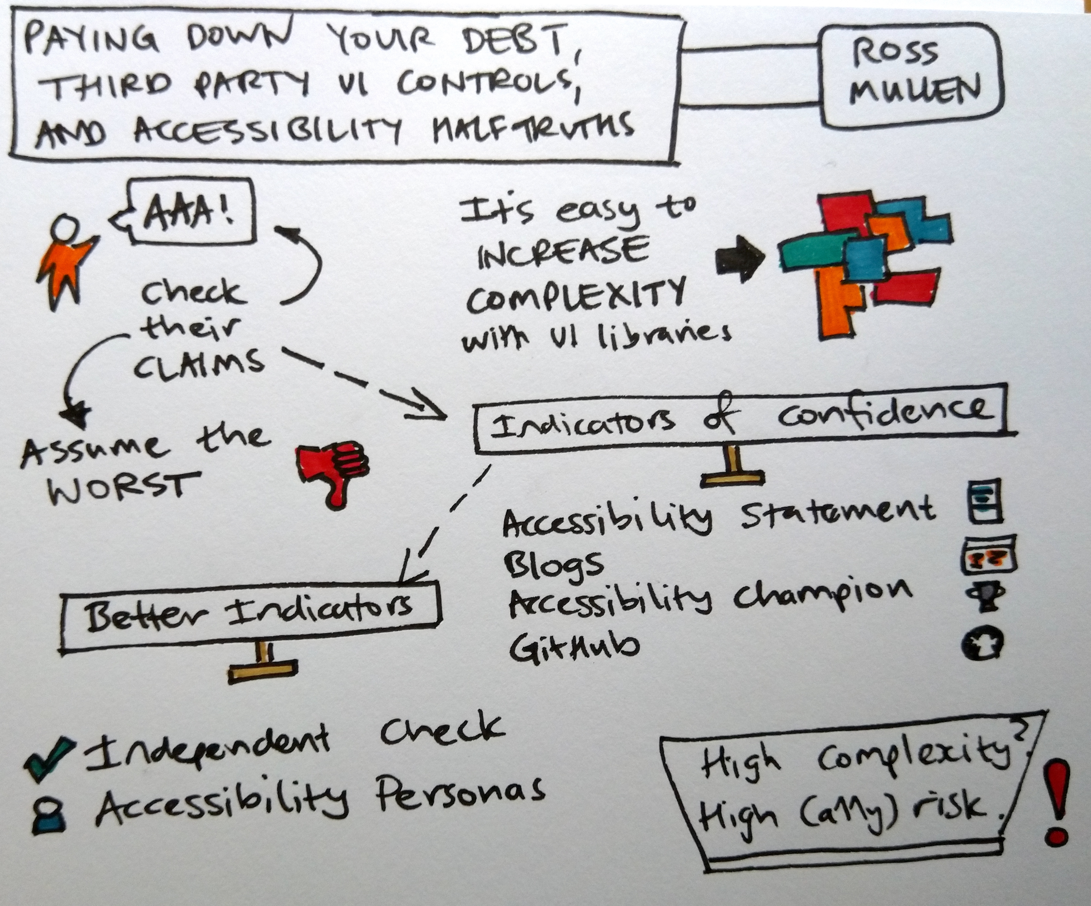
Text version of sketchnotes for "Paying Down Your Debt, Third Party Ui Controls, And Accessibility Half-truths"
- It’s easy to increase complexity by using UI libraries. High complexity means high risk.
- Check UI library vendor claims. Assume the worst.
- Indicators of confidence::
- Accessibility Statement
- Blogs
- Accessibility champion
- GitHub
- Better indicators:
- Independent Check
- Accessibility Personas
My top takeaway: independent checks and Accessibility Personas are good indicators.
“Paying Down Your Debt, Third Party Ui Controls, And Accessibility Half-truths” video on YouTube
And also
Here are all the top takeaways in one go:
- Difficulty modes are just packages of settings. Make granular settings first, then package them up together if it helps.
- Let machines tell people off instead of other people.
- Give people a chance to safely challenge their own assumptions.
- People learn by forming connections.
- Treat automated test failures as flags for things to investigate.
- Independent checks and Accessibility Personas are good indicators.
I also did a talk: Sounds like a good idea: how to get started testing with a screen reader. I’ve also written up a text-y version of the talk.